top of page

Once I had determined the best way of transferring the shimmer layer onto each unique print I got a lot more experimental in the way I was applying it. For the image below, I used a separation technique- exposing two different shapes on the screen where colour will be transferred, yet covering one shape with tape to do two different colours.

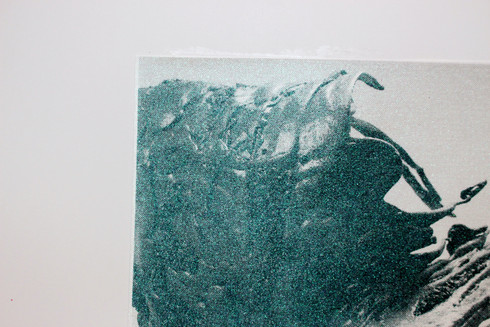
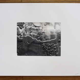
However on the prints seen below I have painted various pigment binders onto the screen, much like fabric screen printing. I really like the effect this creates - it's not true to the original work but it's very abstract.

After painting on the screen I pulled the same ink through again to create more of a marbled, blended effect. These can be seen below...


After doing these experiments I have produced a fair amount of works, some of which I intend to sell and add to the art auction. On my website they have been logged appropriately e.g:


Paper Type: Southbank smooth, mounted onto Southbank smooth.

Paper Size:70 X 50 CM

Size of Image: 40.5 X 40.4 CM

Ink: Lascaux, black

Shimmer layer pigment: Aurora (flip colour) and iridescent green- BLEND.

Variation No.: 1/1


To kick start getting back into work I wanted to explore the processes possible in the print workshop using images from my recent series of sculptures Unhinged Consciousness (2020).

I started creating screens using bitmapped images of my work at various sizes to create the first layers but it was suggested to me that I get really experimental with it. Whereby splitting the printed image to add colour to the areas in which the original sculpture has various colours (as the sculptures are painted so that the colours shift with light). I sought to purchase some inks and/or pigments to add to a clear binder that I could add over the top a simple black layer of ink and managed to get small quantities of different pigments at an affordable price online. These pigments are unique to the colours I tried to recreate from the original work.

Shimmer Violet Shimmer Green Aurora (flip colour) Oblivion (flip colour)


Getting the desired effect I was going for took a lot of trial and error, I found that I needed to expose the screen with just the image on it minus the background for the shimmer/colour layer to create a contrast. I also had to keep testing how much pigment I needed in the binder for the colour to be prominent. As well as this, I opted to use a fabric screen for the colour layer as it had more holes for the colour to transfer easier onto the paper- pulling the pigmented binder through a number of times.


Below you can see how the layers of colour are reactant with light, just like the sculptures. In the first image this was taken without flash/ direct light on it- the second is with. The various coloured pigments weren't too different from one another:

-oblivion is quite unique to them all, changing from red/purple/blue

-green shimmer and violet were very glittery

-aurora was a mixture of shimmer violet and green, dependent on the light.


Nairy Banghramian


I have always appreciated Nairy Banghramian's sculpture/ installation work. I saw this work online and am interested in the way that these collective sculptures, different but similar, seem to be responding to the idea of a relationship between an object and its meaning. Which is something I endeavour to create a dialogue about continually within my work. In this work I take note of a number of things that I (intend to) implement aside from the object relationship:

-dynamics / composition, standing up, laying down, apart but near.

-creating a collective of works that are the same but different

-The use of clamps is really interesting, forcing and holding the material together. Perhaps a metaphorical bond for the 'object relationship' idea.


IMG_1446.jpeg

CONTACT

Your details were sent successfully!

  • Instagram

©2023 by Emily-Rose Delaney

bottom of page